LOGOTYPE
The INFORM logotype is the key component of the company’s corporate design.
It communicates from where the information originates (the company) and identifies all INFORM GmbH media.
Word and figurative mark
The word and figurative mark can be used in all company communications.
If it is not possible to use the color version of the logotype, for example, due to production limitations, the monochrome version may be used.
Minimum size
The word and figurative mark may never be less than 10 mm wide.
Negative-space version
The negative-space version of the logo is not intended for use in general communication media. The negative-space version may be used only in specific cases.
Important
The word mark (logo lettering) should always appear with the figurative mark (rhombus). The logotype may not be arbitrarily modified.
If you wish to use a version of the logotype not described in this manual, simply contact corporate communications:
kommunikation@inform-software.com
Word and figurative mark
![]()
Monochrome word and figurative mark
![]()
Minimum size requirements

Monochrome, negative-space word and figurative mark

two-tone, negative representation of the logo is strictly prohibited.

Minimum spacing
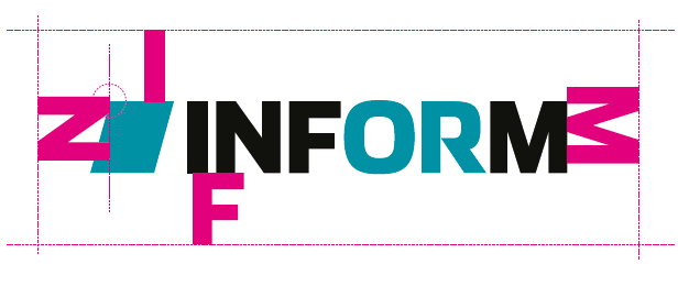
The defined minimum amount of space around the word mark on all sides, meaning the amount of clear space, should equal at least the height of the uppercase letters (I, N, F or M) when completely straight.
The upper corner of the rhombus (the image element) is the reference point for spacing around it.
These guidelines provide for an optically harmonious look and ensure that no other graphical elements compete with the logo.
Logo positioning

There are a variety of placement options for the logo. It is important that there is sufficient white space surrounding the logo and that it’s placed congruently across all types of media. It is important that there is sufficient white space surrounding the logo and that it’s placed congruently across all types of media. This means that the logo should appear in the same position within a particular type of media (e.g., brochure(s)).
Minimum spacing
The adjacent example illustrates the clear space around the logo and the minimum spacing from the formatted edges and image borders in cases where backgrounds are busy or colored, such as in photos.

Positioning, special formats
Word and figurative mark (logo)
Ideally, the word and figurative mark should always appear horizontally.
In special cases, the logo may appear vertically.
(from bottom to top):
- Flags
- Book and magazine spines

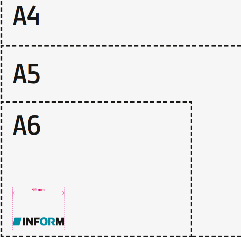
Size on standard formats
Positioning on predefined DIN formats
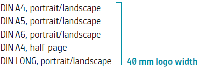
One size – on all the main formats!
DONT’s
When positioning the logo, ensure that it distinctly stands out from the background.
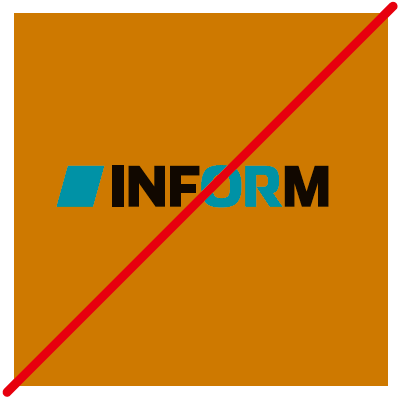
Do not place the logo on colored backgrounds or photos.
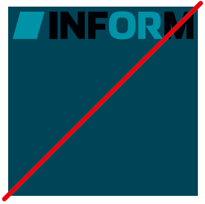
When positioning the logo, ensure there is enough clear space (see previous page) between it and the formatted edge or image border

Downloads

Download

Download
EPS Vector File
- …
PNG Files
SVG files:
Download
EPS Vector File
PNG Files
SVG files:
